Black and gold wallpaper in the interior. Aristocraticism in everyday life: transforming a room with golden wallpaper Wallpaper with glitter in the interior
Gold wallpaper in the interior of any room looks expensive and chic. They are quite versatile, as they have a very wide palette. With their help it is easy to create luxury design any room. The mesmerizing shine attracts attention, reflecting warm light. About the benefits of wallpaper in golden shades and how they combine with other decorations different rooms apartments, how to choose them for certain style, more details in the text of this article.
Features, characteristics, color shades
Golden is the color of energetic movement, solar warmth, physical activity. This is the color of victory and wealth, prosperity and radiance, beauty and glory, experience and wisdom. In some countries it symbolizes immortality, truth, enlightenment, and in some religions it symbolizes melancholy and sadness. When used in the interior, it improves appetite, digestion, and lifts your mood, allowing you to be cheerful all day, but the abundance of its various shades can tire you excessively, even in a short period of time.
In the interior of the Middle Ages and the Renaissance, it was very popular - only very rich people could afford gold, because then this color was considered a symbol of abundance, luxury, and prosperity in the home. In modern design it should be used carefully; excessive amounts of gold are a sign of lack of taste. Therefore, only individual details of the room are decorated in this way.
This color is a mixture of orange and yellow. Thanks to the metallic shine, wallpaper with gilding will easily fit into almost any interior, which will immediately sparkle with new colors and become bright and unique. There are a great variety of shades - from muted yellow to amber-bronze. This is the warmest color, which means it has the ability to “expand” space; when using it, you should strictly adhere to the chosen style in order to avoid chaos and bad taste.
Design and texture
Exist different kinds golden wallpaper:
- made of paper - environmentally friendly, diverse, breathable. But they fade in just two to three years, stick only to very even walls, and strongly absorb any odor. Available in single-layer, double-layer, embossed and embossed. Well suited for bedrooms, children's rooms;
- with fabric fibers - on non-woven fabric, paper based with a top layer of fabric. They look good, but they get very dirty and are difficult to clean;
- non-woven fabrics are dense, but allow air to pass through normally and smooth out minor defects on the walls. Available in stores huge selection, suitable for any room, except those with high humidity;
- made of vinyl - they have a durable PVC layer based on non-woven fabric, paper, often imitate wood, stone, are moisture resistant, and do not fade for a long time. They are completely impermeable to air; some varieties contain harmful additives and chemicals. Great for covering bathrooms, hallways, and kitchens;
- for painting - paper, vinyl, non-woven are available. Essentially, it is a white canvas with a pattern, bas-relief or prints. They can be repainted at least three times;
- liquid - breathable, applied in the same way as plaster, hides any unevenness on the walls. They contain dry glue, glitter, threads, cellulose, and pigments. Available in embossed and smooth.
Wallpapers with a complex convex texture diversify the interior; plain wallpapers look good with textured curtains, being an excellent backdrop for expensive furniture. With the help of a correctly selected pattern, the shape of the room can easily be changed - vertical stripes will visually make the room taller, horizontal stripes will make the room wider and longer.
The most common patterns:
- floral;
- geometric;
- meanders;
- monograms;
- suns;
- Damascus;
- paisley;
- carquelure;
- space.
For tight spaces with low ceilings white wallpaper with a gold pattern or golden with beige is chosen; for more spacious ones, intricate black weaves on a gilded background or gilded on a coffee background are acceptable.
What style does it suit?
Golden wallpaper will perfectly decorate the interior of the following styles:
- art deco, art nouveau;
- classical, neoclassical;
- Rococo, Baroque;
- modern;
- retro;
- shabby chic;
- minimalism;
- high tech;
- ecological;
- futurism;
- Oriental.
Strict geometric designs will best fit into the style of art deco, hi-tech, industrial, but it is important that the curtains and floor decoration have a uniform texture. For a romantic, ecological style, plant and floral patterns are suitable. For the classic - a variety of monograms, damask patterns, meanders framed by borders, gilded moldings, elegant ceiling rosettes. Retro style will be decorated with carquelure wallpaper. For a children's room or a futuristic living room, “cosmic” 3D images are suitable, with which only one wall is pasted, on which there is nothing else.
Combination options with other colors
The traditional, almost “canonical” combination is golden yellow and blue - they are located on opposite sides color wheel. Beige, brown, dark gray, and orange tones are also often used.
Other successful combinations:
- sunny gold with white;
- golden straw with olive;
- wheat-gold with emerald;
- golden green with burgundy;
- antique gold with terracotta;
- golden honey with graphite gray;
- palm gold with turquoise;
- golden-smoky with pink;
- acid gold with black;
- golden peach with milk.
A combination with turquoise and silver will create a strict classic interior, burgundy and black will add solemnity, pale pink and pistachio will set the mood for a romantic mood.
Gradient transitions from golden-orange, bronze to any other look very advantageous in modern interiors.
How to choose the right curtains
When choosing curtains, you need to follow several rules:
- For wallpaper with complex variegated patterns, you should choose plain curtains and vice versa;
- Bright curtains look great, preferably in warm colors;
- it is desirable that the walls contrast with the design of the windows, and not merge with it, but the option of combining is also possible;
- if the curtains are matched to match the wallpaper, then they should be at least two or three shades lighter or darker;
- curtains should be in harmony with other textiles in the room - furniture upholstery, carpets, pillows, wardrobe trunks, draperies on beds, armchairs, etc.
Curtains with vertical or horizontal stripes against the background plain wallpaper slightly change the geometry of space. Light thin curtains are almost always inappropriate here. The most harmonious look are red-brown curtains, café au lait, sky blue, bright green, and violet. But blinds or roller blinds are selected with alternating fabrics - gold with brown, blue, silver, pink and others.
Japanese curtains can repeat the pattern of the walls, if so intended, and Italian curtains have only a gold cord to tie them together. in the right place. Austrian or London ones are decorated with gold ribbons and may have a wide gold cornice that harmonizes with the wallpaper. Curtains in the shape of an hourglass, tied in the middle, are inserted into the frames of the partitions that zone the space of a studio apartment or kitchen-living room. They duplicate the texture, pattern of curtains on the windows, matching the color with the wallpaper or contrasting with it. Interior curtains for a golden interior sometimes look like a crumbling “rain” of gilded beads.
Light curtains with or without a pattern will suit the theme of almost any interior; dark shades are used only for the most spacious rooms and wide corridors.
Combination with furniture, ceiling, floor
In most cases, the floor covering is chosen to be a couple of tones darker than the walls of the room - this will visually create reliable support for feet and furniture, ensuring compositional balance. Lacquered wallpaper goes well with gold wallpaper. batten, parquet, wood-colored laminate, floor ceramic tile, linoleum. The ceiling is preferably light, but may have individual gilded stucco elements. An option for a nursery would be a light blue ceiling with a chandelier in the shape of a sun, which seems to illuminate the walls.
Furniture that contrasts with gold wallpaper looks best; it is chosen several tones darker or lighter. If the wallpaper is plain, the upholstery upholstered furniture a patterned one is selected, and when they have a complex pattern, then sofas, armchairs, poufs, kitchen corners, etc. are decorated with fabrics with a simple large pattern or without it at all. Use gold accessories in moderation; do not clutter the room with many figurines or vases. A central gilded chandelier and a golden edging of the carpet will be enough.
If you use gold wallpaper with gradient transitions from dark to light, then the most saturated color is preferable at the bottom.
Wall design in rooms
Especially bright golden wallpaper is used in rooms with windows facing north - they will give a feeling of “sunshine” in the absence of natural sunlight. Darker ones - chocolate-gold or black-gold - are used in spacious “southern” rooms, where daylight present in abundance throughout most of the day. You should not use too much glitter - this visually “heavies” the interior, so excessively bright gilded trim should occupy no more than one third of the room.
For which rooms is it better to use gold wallpaper:
- living room - a variety of shades are acceptable, in combination with beige, cream, silver, terracotta, fuchsia, emerald, lilac;
- bedroom – as little shine as possible, perfect option– gilding on a light background;
- kitchen - gilded decoration should be neat, but not overly shiny;
- children's room - suitable for very calm children, light muted colors are preferred;
- bathroom - washable ones are occasionally used, preference is most often given to self-adhesive film;
- dressing room - the walls are not particularly visible here, so their coloring does not matter much;
- study - here nothing should distract from work, so the shine is chosen to be minimal;
- loggia or insulated balcony - the walls are decorated in the same color and texture as the entire room.
Any “overlapping” wallpaper should begin to be glued away from the window - if it even slightly peels off along the edge, the seams will not be noticeable and the overall appearance will not be affected. When gluing “end to end” there is no difference where to glue from.
Bedroom with gold trim
The golden walls of the bedroom will turn it into a wonderful apartment. Here you can fall asleep and wake up, imagining yourself in the royal chambers. A minimal amount of glitter should be used - it can interfere with normal sleep; sharp, bright contrasts are also inappropriate. Muted shades give an antique effect, especially the color of red gold.
The most popular options are:
- the wall at the head of the bed is decorated with gold, the remaining walls are decorated with white;
- the wall opposite the bed is decorated with gold photo wallpaper, depicting natural views or abstractions, the remaining walls are plain;
- All walls are covered with light wallpaper with a golden pattern.
Golden wallpaper with images of savannah or desert animals will decorate a unique children's room in an original way.
Living room design options
Large bright living room, designed in classic style, with a high ceiling, light brown curtains, carved furniture, and decorated with wallpaper with a relief damask pattern. If the room is cramped, then many light sources, combined with white wallpaper covered with gold ornaments, light furniture, and a floor design two or three shades darker than the walls, will visually expand it.
A lot of glitter is used here to create a festive atmosphere. Luxurious furniture is also selected, preferably from solid bog oak, pine, spruce, beech, mahogany, rosewood, and walnut. It may have forged elements, which are also decorated with gilding.
A huge sofa upholstered in brown leather, combined with the same leather chairs, an oak wall cabinet similar to it round table on carved legs will fit perfectly into such an interior. Draperies on the windows are combined with furniture upholstery, and wallpaper is combined with carpets and decorative elements placed on shelves and tabletops. Plaster or plastic stucco on the walls and ceiling are often covered with gold, but darker or lighter.

Golden wallpaper in the interior looks expensive, rich and luxurious, giving wide space for choosing styles, textures and shapes finishing materials. The main thing in design is to create a high-quality background and focus on small details.
Advantages of gold wallpaper
- Create an atmosphere of comfort and coziness.
- Emphasize the unusual layout.
- Used for zoning space.
- Hides imperfections and unevenness on the walls.
- They fill the room with additional light and reflect the glare of the sun.
- Allows you to place competent emphasis on details.
Plain glossy finishes are used to decorate one accent wall. Canvases with glitter in golden shades will look good on niches, ledges, fireplace or balcony areas. Dark tones with a golden pattern are used to zone the space; most often they cover only part of the wall. Look at the photo to see what golden wallpaper looks like in the interior.
Rules for using color
- Maintaining proportions. The optimal ratio is 1:3. The right amount of gold will help expand the space and create additional light in the room. The excess of this color is difficult for the eyes to perceive. It is important to remember about asymmetry: when decorating one accent wall in golden tones, the second should be left clean.
- Color distribution. The gold should be concentrated in one place and not throughout the room. If gold-tone wallpaper is used in the interior, it means that there should be little of this color (details, objects) in the decoration of the rest of the room.
- Unity of design style. When designing in a classic style, it is unacceptable to use modern lamps. Antique floor lamps will be just right.
- Combination of shades. Muted tones reminiscent of old gold will fit into a shabby chic finish. Bright shades are appropriate in a minimalist design.
How to use color correctly, look at the photo.

Interior items
Use gold finishes carefully so as not to overload the room with one color. Golden shades on objects and interior details will create an atmosphere of luxury and wealth. Among them:
- furniture: gilding on wood, muted metallic shine;
- frames for paintings and photos (an excellent visual effect can be achieved using black and white images);
- mirror plates in a gilded frame;
- gold-plated bathtub;
- chandelier on a fabric base or with golden glass beads;
- door handles;
- art objects: gold-plated sculpture, paintings painted in gold;
- textiles: pillows, bedspreads, upholstery.
See how decorative elements are correctly combined in modern design.

Combination with other colors
The most common combinations of golden wallpaper in the interior are:
- with pastel shades: create a gentle and exquisite design, suitable for different styles;
- With yellow tones: used to decorate kitchens, living rooms, bedrooms and children's rooms;
- with shades of blue: they look original and impressive in antique styles, fill the room with freshness and lightness, and are suitable for design in a marine style;
- with chocolate, brown, terracotta tones: fit well into classic design, focus attention on expensive furniture;
- with green shades: most often these are coatings with fancy geometry or plant motifs, which are often used in the classic style.
Gold goes well with gray, beige, peach, and white tones. Color combinations with bright colors (red, pink, burgundy, purple) are increasingly found in modern design, creating a dynamic and passionate environment. It is not recommended to use such shades in bedrooms.
For small rooms, a combination of gold with gray or white is suitable. In combination with black it can be used as a secondary color. Take a look at how gold canvases in the interior look in the photo.

Stylistics
The texture, material, shades of gold depend on the chosen style for decorating the room. To create a competent environment in the room, consider the following:
- Monochrome coatings fit best into minimalism and hi-tech;
- dark patterned fabrics are suitable for classics;
- in Art Nouveau, plain gold coatings or canvases with a pronounced texture are used;
- Art Deco style welcomes strict ornaments;
- Bright canvases with golden patterns will fit into oriental styles.
On the picture modern finishing in Art Nouveau style.

Gold color in the living room
Gold-look canvases will add aristocracy and wealth to your living room design. You need to select furniture for such premises based on your preferences. To emphasize lightness and sophistication, you will need light colors: beige, pastel, milky tones. Brown and black colors are used to create rigor in the design.
You should pay attention to the design of interior items. Gilding looks good on:
- textile elements;
- lamps.
Golden curtains would be a great addition.
Classic and modern solutions are suitable for decorating the living room. IN modern designs You should focus on a separate wall, decorating it in golden tones. Antique stylization looks impressive against the backdrop of gold paintings placed around the entire perimeter of the room. This is what such wallpaper looks like in a living room interior.
Golden linens in the bedroom
Most often, such accents are used to decorate the bedside area; floral patterns, classic patterns or strict stripes are popular. Opposite the bed, canvases with a relief texture in warm colors would be appropriate.
To fill the room with light, hang gold wallpaper around the entire perimeter of the room. The principle of zoning space with golden accents is often used in children's rooms.
At correct selection shades and themes, such wallpaper is suitable for bedrooms of any size. They will fit favorably into classic, provincial, baroque, and art deco designs. See what gold wallpaper looks like in a bedroom interior.

Decoration of the kitchen and hallway
Kitchen decoration in golden tones is not common - this is necessary to create a solemn and aristocratic atmosphere.
Basic Rules:
- You can use plain or patterned fabrics - it depends on the style and layout of the room.
- Furniture can be made in antique or modern style and have any shape.
- It is not recommended to install dark-colored headsets.
Golden wallpaper in the hallway interior will help expand the space of the room. In low-light rooms, combine gold finishes with light-colored fabrics. Look how it looks in the photo.

How to choose curtains
The main accent in the room should be gold wallpaper, so curtains should be selected in light shades: beige, white, soft gray, yellow. Products in olive, brown and chocolate tones look good. Good options are beige, cream, light gray colors. The material of the curtains should be dense and heavy; light fabrics contradict the theme of the design. Look at the photo.
Gold wallpaper will bring solemnity and luxury to the interior and fill the space with light. Thanks to various decorative items, you can stylize the room as antique, create spectacular accents, expand the space and divide it into zones. I wish you all success! Bright and interesting solutions!
You can see how black and gold combine in the video:
12734 0 4
Ah, this luxurious gold color in the interior of 2016: all the gold glitters!
Gold is a popular interior color that has been used to decorate homes for centuries. Today, golden accents in design are not only an elite classic solution, but also the chic of modern styles. It is only important not to overdo it with the amount of this color in the design and find out what the gold color goes best with in the interior.
This is what we'll do!

Golden hue in detail
The golden tone is multifaceted and rich; it can be used both in accessories and decoration, and in completely different styles. However, an interior in golden tones requires, above all, moderation..
But that’s not all, it’s important to choose the right color combinations and organize suitable lighting. It seems to me that this tone is best suited for those who want to add coziness to the room, and, of course, luxury!

The right light is the key to the success of a room decorated in golden
Wall decoration
Gold wallpaper often has a pattern and a different primary color, so as not to make the room too cramped. Geometric and floral patterns, stripes and other designs combined with a lighter base shade will make the room feel more spacious.

Gold wallpaper in the interior is not the only suitable solution for decorating walls in this color. Sprayed plasterboards, tiles, and stone-like finishes are also suitable.
In styles popular in 2016, for example, minimalism, modern or high-tech, I advise you to use wallpaper with stripes. Frequent and narrow stripes of gold on the wallpaper will fit perfectly into.


You need to select the optimal amount of “gold” in the room based not only on the style, but also on the area of the room, additional colors, and accessories. It is believed that there should be no more than 1/4 of gold in the overall palette of the room.

Furniture
Golden furniture looks appropriate not only in the living room, but also in the bedroom, hallway and even the bathroom. Moreover, with the right selection of shades, chairs, sofas, and other items will fit both into retro or classical styles (neoclassical, rococo, baroque) and into a modern interior (shabby chic, Provence, Scandinavian minimalism).


Lamps
The lamps themselves dilute the room due to the lighting they produce. Therefore, golden solutions will fit perfectly both into rooms with prevailing light tones and into darker interiors.

Luxurious golden chandeliers are characteristic of classic design solutions and Baroque style, and compact modern lamps fancy or strict geometric shapes are suitable for high-tech, fusion, and modern. Compared to other stages of renovation, the price of the lamp is not high, but it can add new color accents to the interior.


Other accessories
Small accessories in the right color work best with any style, as they add a luxurious accent without drawing too much attention to themselves.
I like to “play with colors” in rooms with the help of small but noticeable things, since in this case you can transform the design with your own hands without finishing or repairing.

What accessories can be made gold:
- Frames of pictures and mirrors.
- Upholstery of sofas and armchairs (or sewing on them).
- Candlesticks and candelabra.
- Backs and legs of furniture, handles of chests of drawers, drawers, doors.
- Curtains and textiles.

Color compatibility
Gold in the interior always looks advantageous with warm shades– brown, chocolate, red and its tones (burgundy, purple). In more modern styles, such as hi-tech, fusion and modern, brighter golden accents are used.
And you can combine them more boldly - with silver, yellow and orange, green and turquoise, coral and pink. The combination with black also looks catchy and aristocratic.

Popular simple instructions combinations of gold with other shades - use a classic base. That is, a shade that occupies at least 40-50% of the interior. It can be white, beige and their shades, which will highlight the extravagance of gold.
What to combine gold with in the interior:
- Reds and its shades (purple, burgundy, marsala). Red is the color of luxury, so it looks great paired with rich gold. I recommend choosing muted shades of red rather than “poisonous” ones. To avoid the gloominess of the room, you can add white and beige to the palette.

- Shades of brown. Gold goes well with both light shades (beige, cream) and dark shades (coffee, chocolate) in the interior. At the same time, it is difficult to overdo it with the amount of gold; shades of brown complement and dilute it, creating an aura of warmth, luxury and chic.

- Green and its shades (mint, turquoise). Cold turquoise can be safely combined with gold. I recommend adding white or cream colors to the palette, or using not only bright, but also calmer golden shades.

- Black. Dark tones in combination with gold look at least extraordinary. In modern interiors, this combination is popular, both with the abundant addition of white and with its minimal inclusions. In the second case, the interior turns out to be quite dark, but elegant.

conclusions
Gold always looks impressive and luxurious. It seems to me that at the design stage it is not very easy to work with, but then, with successful planning and combination, enjoying an interior with golden notes is a pleasure!
Do you like gold in the interior? How did you implement it into the design? Share your ideas in the comments, I can't wait to see what ideas you like to incorporate this shade into your design! And even more interesting solutions can be found in the video in this article.
June 26, 2016If you want to express gratitude, add a clarification or objection, or ask the author something - add a comment or say thank you!
Color has long ceased to be just a name for the color of an object. IN modern world not only psychologists, but even ordinary people recognize the influence of different shades on a person’s psycho-emotional state. Therefore, it is incredibly important what tones and colors surround us, because they can play a key role in behavior and have a strong influence on our mood.
How does the color yellow and its shades affect the psyche?
As you know, the color gold is derived from yellow. What associations do you have when you hear the words: sunflower, sunshine, chicken, smileys? Of course, the following: warmth, summer, high spirits, joy, activity. It’s not for nothing that yellow is considered the color of the active and young. If your apartment or room is decorated in this sunny, warm color, then it will stimulate the speed of brain processes and decision-making, yellow in the kitchen will activate appetite and improve digestion, and in the nursery it will help the baby to be more dexterous and flexible.
But, as everywhere else, there is a flip side to the coin. An abundance of yellow, like an abundance of stimulation, can tire and lead to a state of mental and physical exhaustion.
As a result, nervousness, loss of strength and even depression may occur. In addition, yellow, or rather some of its shades, can visually “eat up” space, which is simply detrimental to small rooms. Therefore, it is necessary to choose shades of yellow and their quantity extremely carefully.
Golden is the king of flowers

It would seem that there is something special about this color. Indeed, at its core, the shade of gold is a combination of yellow and orange, with its inherent specific metallic shine, which makes this color special. It will also be interesting that it looks completely different in person and in photographs.
The point is precisely this mesmerizing metallic shine, which not a single monitor or photo can convey. You should only look at gold in person, and it doesn’t matter if it’s an ornate ring on the counter of a jewelry store or the decorated walls of a palace.
Golden wallpaper in the interior from the Middle Ages to the present
The golden shine of walls and furniture always evokes thoughts of luxury and wealth. It gives a feeling of some special charming warmth and comfort. That comfort and gloss that was inherent in royal palaces and noble estates, and which is so lacking modern apartments. But here it is very important not to overdo it, because an excess of glitter and gold can create a feeling of boasting and boasting of the owners of the house, instead of the desired aura of sophistication and wealth.
This tone is used to create a chic interior in styles such as:
- Baroque
- Rococo
- Classicism
- High tech

4 basic rules for using gold wallpaper
To highlight the best aspects of your interior using gold-colored wallpaper and, at the same time, not to overdo it, indicating the bad taste of the owners of the house, you need to adhere to four simple rules for using this color in the design and decoration of premises.
- The most important thing is a sense of proportion. It should be understood that gold belongs to warm colors, which means that you cannot use it in large quantities, as it visually eats up space. An excess of this color is difficult for the eyes to perceive, especially in well-lit rooms, where gold will also create glare. Experienced designers It is recommended to use it in a ratio of 1:3, diluting it with other colors.
- If your sense of style is poor, then it is better to entrust interior design with gold-colored wallpaper to professionals. After all, the main thing here is to make either one big accent or several small ones. For example, if you decide to decorate a room with gold wallpaper, then everything else, with the exception of one or two small accessories, should be done in calmer colors.
- Strict adherence to one style is extremely important when you are working with the color gold. If your wallpaper sparkles with classic monograms, or has numerous patterns and ornaments, then Art Nouveau lamps and Arabian golden pillows will simply be inappropriate.
- Play with shades. Different tones of gold are inherent in different directions in interior design. Muted, antique-style, will be appropriate in a classic design style with patterns, and shiny and bright - in different directions of modernism.

How to combine gold wallpaper with other colors
As mentioned above, gold is appropriate in the interior in a 1:3 combination. And it’s incredibly difficult to find a pair for it. It can only be noted that this color harmoniously combines with most light and pastel shades. Such color combination, like gold with grey, white, peach or beige, will create a feeling of lightness in the room and will also promote rest and relaxation.
The combination of chocolate furniture and golden wallpaper will give the room a special radiance and richness. It is also interesting that manufacturers often choose some kind of base for elaborate monograms or designs. So, on sale we can often see red, brown, blue, light blue, burgundy, white or gray wallpaper with gold patterns.
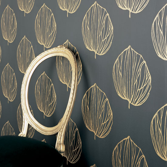
For lovers of a stylish and expensive interior, a tandem of black and gold is suitable. With such an interior solution, you need to correctly place color accents. Do not dilute this combination with any other colors. Black in this combination should be the background, and gold will serve as wall decoration, door handles, furniture fittings, accessories.
Which curtains to choose for gold wallpaper

Curtains with gold wallpaper for rooms such as a living room, bedroom or kitchen should be selected with special care. I take into account the specifics of this bright shade, most designers advise choosing curtains in soft, light colors. The most commonly used are: beige, muted light green, creamy light gray and other similar options.
Golden wallpaper
Any color used in interior design is associative and carries the main meaning for all those who are in the room. Many people associate the golden color with wealth and luxury, but besides this, do not forget that it is also a shade of yellow and is intended to bring joy and warmth into the interior.

The interior can be very harmonious
Shade characteristics
The use of golden-colored wallpaper is acceptable in almost any interior, but in order to ensure that this shade does not spoil the decor, you need to pay attention to the following:
- Sense of proportion - this color is included in the category of warm. At correct use and with sufficient lighting, it can expand the boundaries of any room and bring warmth into it. Please note that oversaturation with this tone gives reverse effect, and everyone who is in the room experiences a feeling of discomfort. Therefore, in order not to spoil the perception of the interior of a room with golden-colored wallpaper, you need to use it in a ratio of 1:3, diluting it with companion colors;
- A sense of style means that the use of this shade is not allowed everywhere, but only partially. And if gold-colored wallpaper is used in the design of the room, then a different color scheme should be used for the rest of the interior elements;
- Unity of style - the use of wallpaper with a classic print, pattern or stripes implies the presence in the interior of other elements, also designed in a classic style. At the same time, the presence of lamps and decorative items in the Art Nouveau style is not allowed;
- The shade of the wallpaper should match the direction of the interior itself. A more muted golden color is always appropriate in a shabby chic style room.
Please note! The color of the curtains, when combined with wallpaper of a given shade, should be slightly darker than the surrounding walls.

Photo: a luxurious holiday will be provided here
Color combination
You shouldn’t use too much golden color when decorating your interior, and what’s more, you need to choose the right combination. To visually add light and space to the room, you should pay attention to light colors that go well with gold: gray, beige, white, peach.
If you need to focus on expensive furnishings, then chocolate and terracotta colors are used for the combination. For example, gold wallpaper will go well with dark wood furniture.
A special style is brought by the combination with black, and golden should only be used as a secondary color.

Photo: interior of a luxurious and soulful living room
Where to use
When creating the design of almost any room, you can use golden wallpaper:
- living room (hall) - golden is best combined with black, beige and brown tones;
- bedroom – golden in light shades is best used only as a pattern and print with pictures;
- bathroom - applicable in plumbing details, for decoration.
Gold wallpaper is always associated with luxury, wealth, and material wealth. Golden wallpaper in the interior has special meaning. They were used to decorate palaces and castles. The magic of golden color has always attracted special attention. Currently, gold color is still used in interior design. Designers choose it for decoration country houses and city apartments, making gold wallpaper a real fashion brand.
Rules for using yellow
Yellow wallpaper must be used correctly in the interior. There are certain rules regarding the use of yellow wallpaper in home design.
1 rule. If you decorate a wall with yellow wallpaper, you need to clutter it with massive gilded objects, big amount furniture.
Rule 2. Yellow wallpaper should be combined with gold threads and embossing on textile elements used in interior design.
Rule 3. Yellow wallpaper should be used in moderation; you can choose canvases with beautiful geometric patterns or flowers.

Nobility of yellow color
The yellow tone is associated with the nobility of gold. In order for it to look appropriate, it is necessary to “dilute” it with an additional shade. For example, yellow wallpaper on the wall can be with a gray pattern. If you use green or blue canvases with thin gilded threads to decorate the walls, you can complement them with gilded candlesticks, gilded bed legs, luxurious frames of mirrors or paintings.

Such details indicate the aristocratic taste of the owner of the premises. Massive furniture with artificially aged, dim colors, green canvases on the walls, gray curtains on the window openings look interesting.
Advice! For lovers of luxury, interior professionals recommend complementing the gilding with black or gray shades.

Do you know if it is possible to combine green and gray shades with black and yellow flowers? In this case, study useful tips offered in the video fragment
Style solutions
Do you want to use gray or black colors when decorating your room? In this case, it is important to take into account the features of the chosen style. For example, in the shabby chic style, furniture elements and decorative accessories are highlighted in gold, and the walls can be gray or black.

For classic baroque, it is allowed to use a combination of gold color in textiles with black or gray tint figurines.
Attention! Warm golden color goes well not only with light tones, but also with gray and black objects.
If gray or white colors are chosen when decorating the walls, then choose bedspreads and pillows in the interior in a peach or beige shade, embroidered with gilded threads.

Terracotta interiors, as well as black and chocolate shades go well with luxurious yellow. To give the created interior a feeling of luxury and nobility, you can use furniture made from natural solid wood, as well as curtains in a rich brown tone.
Using a combination of black and gold dominant shades in the interior helps to achieve an amazing result; the result of this combination will be an individual and amazing style. In such a tandem, black should be the predominant shade.

Advice! You can choose a black furniture set with gilded legs and handles. Black bedspreads look divine and decorative pillows, painted with gilded threads.
The room, in the design of which uses turquoise shades, complemented by gilded decorative elements.
Interior professionals consider the combination of golden and purple shades to be a real fashion trend of the season.

Gold in the bedroom
The color of the noble metal fits perfectly into a bedroom decorated in Art Deco or Baroque style. Fans oriental style can use numerous gold accessories.

Wallpaper with luxurious gold embossing helps create a unique atmosphere in this room and home comfort. Additional gold stucco on the ceiling, original figurines with a noble patina, lightly gilded frames for mirrors and paintings, and yellow lamps help emphasize the grace of the Baroque.

They try to decorate modern bedrooms in light shades, to which all varieties of gold are suitable.

Luxurious living room
Noble luxury and elegant aristocracy are emphasized in the living room by gold color. Wallpaper made to resemble gold in such rooms is considered the main detail of the interior. This type of trellis is suitable for a furniture set in black, beige, or brown.

If you prefer to choose beige and light shades for the interior, in this case you can complement them with golden tones on flowerpots and lamps. The main rule is asymmetry. In this case, the details will have a more impressive and attractive appearance.

An interesting solution would be to place a picture in a gilded frame on one of the walls, and no decorative elements are expected on the opposite wall. The presence of curtains with gilded threads on the window openings will be a hint of the wealth of the apartment owner.
In this case, additional wall lighting will act as a relevant element. For example, on both sides of the picture you can attach miniature lamps with a gilded frame.
Gold bathroom finishing
With the help of gilded decorative elements you can emphasize the aristocracy and sophistication of a spacious, bright bathroom. If there is not enough lighting in it, then you can use the color of the noble metal to correct such a deficiency. But when decorating a small room, you risk further reducing the available space.
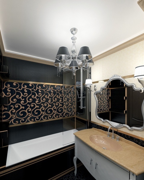
Advice! For small bathrooms, you can choose a gold finish on the plumbing elements and furniture.
Interior designers recommend using gold jewelry not throughout the room, but using it to accentuate only individual interior details. We offer some tips that can help you make just a slight hint of wealth and luxury:
Among the innovations taken from the interior fashion of the 18th and 19th centuries, it is necessary to note the use of the classic combination of mirrors in gilded frames with delightful screens made of mirror plates.
Interior professionals advise using a variety of art objects to modern interior. For example, you can paint a picture of impressive size in gold, or attract attention with gilded figurines mounted on coffee table. In the kitchen, it would be appropriate to design a mosaic apron in the color of a noble metal.

Conclusion
Currently, interior designers are resorting to a combination of black and gold colors more and more often. The reason lies in the unique image that will eventually be formed. Lovers classic interior can safely purchase materials with gilded threads and trim.

The main rule that is important to consider when using yellow and gold shades in the interior is not to overdo it with these colors. With the right combination of the color of noble metal with other delicate shades, you can create the visual effect of a spacious and bright room.


